The history of the Urban Artifact brand isn’t that old, but there are many nuances that might be interesting to people not involved in the process. Honestly, I’m not sure if these details are unique, as I have only been responsible for helping one brewery stretch into existence. But I’ve read a few books that other far-more-successful folks have written on the subject, and realized that our path is Our Path. While we were rushing through the startup process, it almost seems like the naming discussion was completely separated from the hustle and bustle of the operations, construction, and money talks. On one hand, the name didn’t matter – if we made good beer and created a good atmosphere, people would appreciate the effort. On the other hand, we’re jumping into a business market that is proven to be based more on branding than practically any other element.
Original naming discussions started out with a lengthy spreadsheet, literally hundreds of names, and the four owners ranking, rating, and explaining their favorites. We had a lot of back and forth about representing our location (Northside, Blue Rock, Losantiville, Cincinnati), about representing our site (church-related themes, building words) and about what each of us thought made a good name. The base criteria we created was that our name needed to be a bit more robust than other brewery names, at least from a usage perspective. We wanted it to look good and sound good referencing: a beer, a can, a music venue, a record label, and a destination. The need for balancing the music and beer is deep-rooted in our business plan, and so we were discussing those ramifications very early.
After that need was established, we started brainstorming ways to express ourselves – not necessarily as only one thing, but as a representation of what we do. We had fairly quickly settled on the name Artifact and added the adjective Urban both as a way to differentiate ourselves from other uses of the single Artifact, but also to better represent who we are as a community-gathering brand. The Urban represents the density of people needed to make a business like ours work – to fill the taproom, drink the beer, and to support the musicians. We spent some time making sure we were comfortable connecting the two words together and making sure they fit our basic criteria. Can you drink an Urban Artifact, go to Urban Artifact, see an artist performing at Urban Artifact, ask for a pint of Urban Artifact?
We bought and renovated a vacant, historic church building in the center of one of Cincinnati’s greatest neighborhoods. Northside has an identity stronger than most any other spot in the city, and we cherish the opportunity to build upon that. We love our church building, we love our neighborhood, and we embrace the notoriety that comes with both of those. Re-establishing the wonderful St. Patrick’s facility as one of the largest gathering spots in the neighborhood is an important responsibility for us as we continue to grow, too. Therefore, one of the primary graphic and experiential elements of our brand is the church building. It IS our Urban Artifact. It represents both our home, our community, and our character.
The logo, crafted expertly by Jason Snell with We Have Become Vikings is pulled from the exterior of the remaining stained glass rose window on our facade. Occasionally we use a hexagonal badge to capture the logo, and this shape is pulled from the attic vent just above the window itself. Jason also heard our requests for something “looser” to base the brand imagery around and created the double watercolor circles to hold the logo in place graphically. We use those for full-color printed projects where the logo needs to float, so it doesn’t show up many places. But it does inform a lot of our additional branding elements, from labels to posters and everything else.
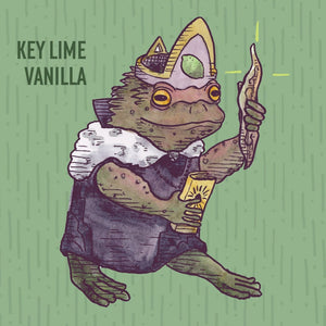
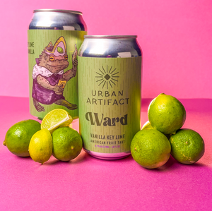
The other aspect of the name that is the actual meaning of Artifact. We use that as a basis for our beer names, relying on artifacts as old items (Flash Lamp, Keypunch, Whirligig), historical references (Hippodrome, Finn), or outdated concepts (Palmistry, Phrenology). We take the artifacts seriously, and are heavily invested in the adaptive reuse of our building, as well as lots of elements inside. We reused the old steam radiators as the bar front (they were hanging from the basement ceiling). We repurposed all of the old maple wood flooring that was in the gymnasium (where our brewery is now) as an acoustic treatment in the music lounge, behind the bar as our taplist, and as all of our tap handles. We salvaged the lights from the garage on site to hang over the bartop. The bar itself is salvaged live edge wood slabs. And the taproom is filled with tables and benches salvaged from old buildings demolished locally and given new life in our room.
Cheers,
Scott Hand
Chief of Organization


