
The distinct Urban Artifact art style is a combination of constraints. Most all of our label artwork starts out with a beer name and style concept. From there, it’s a visual ideation, which is a blend of research, doodling, and discussing what the character or “artifact” is supposed to represent. The characters shown on the perennial beers are in honor of those folks and their professions. The artifacts on the Midwest Fruit Tarts are generally visual hallmarks of yesteryear.

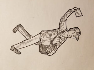
Original pencil + ink page.Both of those art projects start as pencil on paper. After a certain visual idea seems to work well with the beer idea, then it moves to ink. This step can often get repeated several times. Often it’s because:
1) the permanence of ink (if the lines just don’t end up in the right spot, it gets scrapped),
2) the proportions seem off (the drawing could be fine, but it didn’t hit the label or boundaries of the finished product correctly), or
3) a better idea came along.

Final character digitized with color.
Cheers,
Scott Hand
Chief of Organization


